
Introduction
Typography can make or break your design.
You might have great visuals, colors, and layout…
👉 But if your typography is poor, your design will still look unprofessional.
In this guide, we’ll cover the most common typography mistakes and how to fix them.
Why Typography Matters
Good typography:
- Improves readability
- Enhances user experience
- Builds brand identity
- Increases conversions
👉 Especially important for ads, websites, and social media posts.
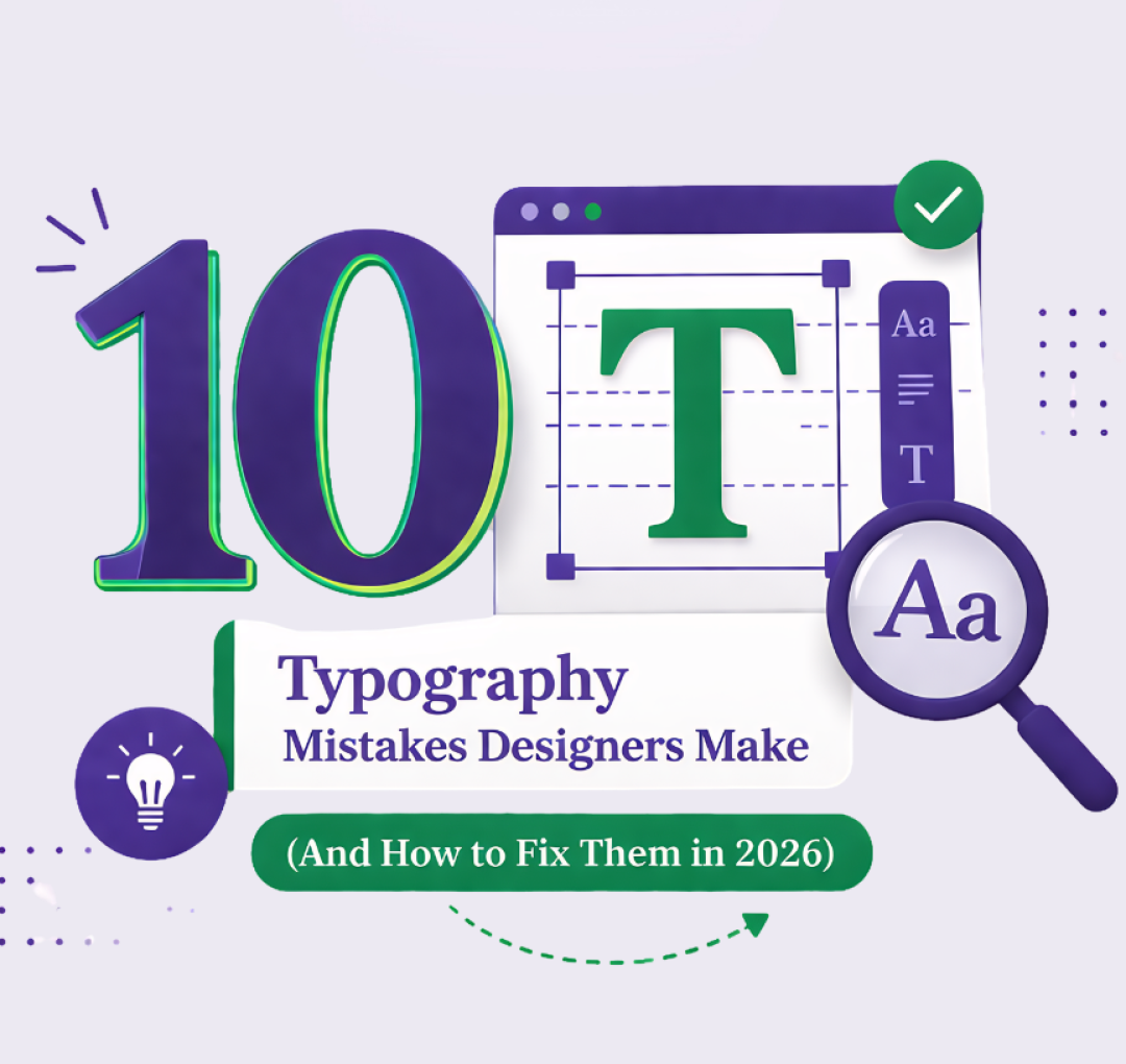
10 Typography Mistakes Designers Make
1. Using Too Many Fonts
Using multiple fonts makes your design messy.
Fix:
👉 Stick to 2-3 fonts max
- One for headings
- One for body text
2. Poor Font Pairing
Not all fonts work well together.
Fix:
- Pair serif with sans-serif
- Use font combinations that complement each other
3. Bad Font Size Hierarchy
If everything looks the same, users get confused.
Fix:
- Headline → largest
- Subheading → medium
- Body → smaller
👉 Create a clear visual hierarchy.
4. Low Readability
Fancy fonts may look good, but can be hard to read.
Fix:
- Choose clean, readable fonts
- Avoid overly decorative styles
5. Improper Line Spacing
Text that is too tight or too loose is difficult to read.
Fix:
👉 Use proper line height (1.4-1.6x of font size)
6. Bad Alignment
Random text placement looks unprofessional.
Fix:
- Use left alignment for most content
- Keep everything consistent
7. Poor Contrast
Text that blends into the background is hard to read.
Fix:
- Use high contrast colors
- Example: dark text on light background
8. Ignoring White Space
Crowded text overwhelms users.
Fix:
👉 Add spacing around text elements
9. Overusing ALL CAPS
ALL CAPS can feel aggressive and reduce readability.
Fix:
- Use caps only for short headings
- Avoid paragraphs
10. Ignoring Brand Consistency
Using different fonts across designs weakens branding.
Fix:
- Stick to a defined font system
- Maintain consistency
Real Impact of Good Typography
Good typography can:
- Increase engagement
- Improve readability
- Boost conversions
👉 Especially important for marketing creatives.
Pro Tips for 2026
- Use modern fonts like clean sans-serif styles
- Test typography on mobile devices
- Keep it simple and readable
- Focus on clarity over creativity
Quick Typography Checklist
Before finalizing your design, check:
✔️ Are fonts consistent?
✔️ Is text readable?
✔️ Is hierarchy clear?
✔️ Is spacing proper?
Final Thoughts
Typography is not just about fonts – it’s about communication.
Fixing these small mistakes can instantly:
- Improve your designs
- Make your work look professional
- Impress clients
Want clean, professional designs that stand out?
Start fixing your typography today – or work with experts to elevate your visuals.