
Introduction
Have you ever noticed how certain brands instantly make you feel something?
That’s not random – it’s color psychology.
Big brands like Coca-Cola, Facebook, and McDonald’s carefully choose colors to influence emotions and behavior.
In this guide, you’ll learn how to use colors strategically in your designs to increase engagement, trust, and conversions.
What is Color Psychology?
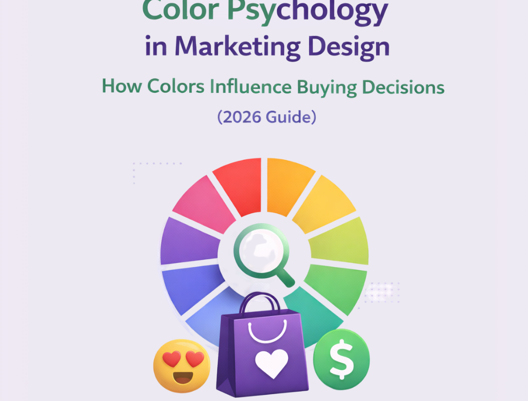
Color psychology is the study of how colors affect human emotions and decision-making.
👉 In marketing, colors can:
- Attract attention
- Build trust
- Create urgency
- Influence buying behavior
Why Color Matters in Design
Studies show that users form opinions about visuals in seconds.
👉 Color plays a huge role in:
- First impressions
- Brand recognition
- Conversion rates
Meaning of Different Colors in Marketing
Red – Energy & Urgency
Used for:
- Sales
- Discounts
- Food brands
Emotion:
- Excitement
- Urgency
- Action
👉 Example: Coca-Cola
Blue – Trust & Professionalism
Used for:
- Tech companies
- Corporate brands
Emotion:
- Trust
- Security
- Stability
👉 Example: Facebook
Yellow – Attention & Positivity
Used for:
- Promotions
- Highlighting elements
Emotion:
- Happiness
- Optimism
- Alertness
👉 Example: McDonald’s
Green – Growth & Health
Used for:
- Eco brands
- Finance
- Wellness
Emotion:
- Calmness
- Growth
- Balance
Black – Luxury & Power
Used for:
- Premium brands
- Fashion
Emotion:
- Elegance
- Authority
- Sophistication
White – Simplicity & Cleanliness
Used for:
- Minimal designs
- Healthcare
Emotion:
- Purity
- Clarity
- Simplicity
How to Use Colors Strategically
1. Match Color with Brand Message
Ask:
👉 What emotion do you want to create?
- Trust → Blue
- Urgency → Red
- Luxury → Black
2. Use Contrast for Better Visibility
High contrast improves readability.
Example:
- Black text on white background
- Yellow CTA on dark background
3. Highlight CTAs with Bold Colors
Your call-to-action should stand out.
👉 Use:
- Red
- Orange
- Bright colors
4. Stick to a Limited Color Palette
Too many colors = confusion.
Rule:
👉 Use 2-4 main colors only
5. Consider Platform & Audience
Different audiences respond differently.
👉 Example:
- Younger audience → Bright colors
- Corporate audience → Neutral tones
Common Color Mistakes
- Using too many colors
- Poor contrast
- Ignoring brand identity
- Choosing colors randomly
Real Impact of Color Psychology
Good color choices can:
- Increase conversions
- Improve brand recall
- Boost engagement
👉 Especially important for ads and social media designs.
Pro Tips for 2026
- Use gradient color styles (trending)
- Test different color variations in ads
- Use color to guide attention
- Keep accessibility in mind
Final Thoughts
Color is not just design – it’s strategy and psychology combined.
If used correctly, it can:
- Influence decisions
- Increase sales
- Strengthen your brand
Want designs that actually influence customer decisions?
Start using color psychology – or work with experts to create high-converting visuals.